

WE BUY & SELL
NEW & USED
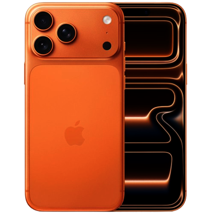
iPhone, Galaxies & More
Buy • Sell• Finance

What are you shopping for ?
SAMSUNG
APPLE
Trusted by Buyers & Sellers
Like New Quality
Every device is fully tested, certified, and inspected to ensure premium performance.
Best Market Prices
Buy premium smartphones at unbeatable prices or sell your device for top value.
Buy & Sell Confidently
Trusted platform for buying and selling new & used phones with transparency.